Introduction aux méthodes quantitatives avec
Session introductive
Chapitre introductif
Note
- Exercices associés à ce chapitre ici

Qui suis-je ?
- Travaux à l’intersection entre informatique, économie, sociologie & géographie:
- Ségrégation avec données de téléphonie mobile
- Inégalités alimentaires à partir de données massives de supermarchés
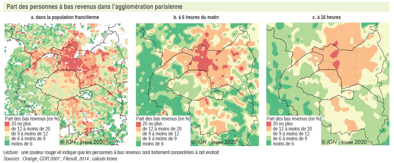
Exemple tiré de l’Insee Analyse sur la mixité sociale
Diversification des données (1/4)
Données tabulaires classiques
- Données structurées sous forme de tableau
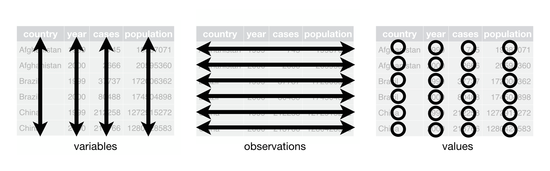
Source: Hadley Wickham, R for data science
- très bien outillé pour ces données (si volumétrie adaptée)
Diversification des données (4/4)
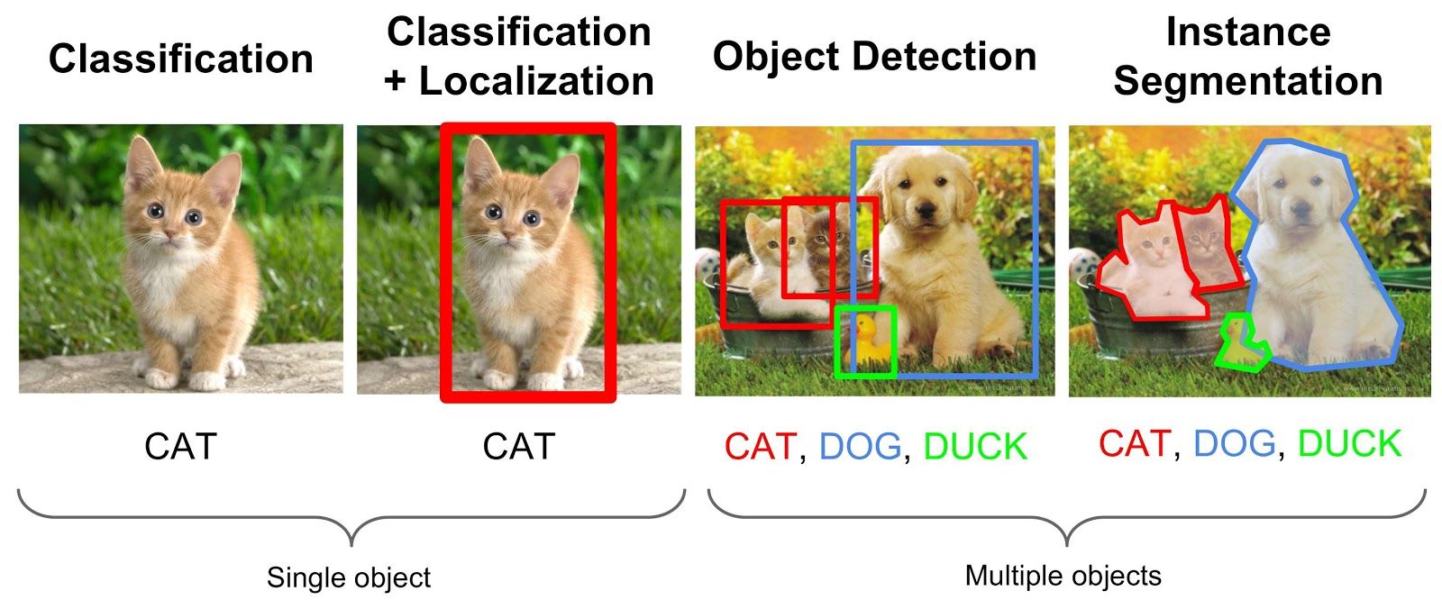
Images, sons et vidéos
Plus d’infos dans mon cours sur les données émergentes
Data is everywhere

L’Insee
- Collecte, produit, analyse et diffuse l’information statistique :
- Producteur de statistiques (enquêtes, données administratives) ;
- Producteur d’études pour le débat public (rare chez les instituts statistiques)
- Publie énormément d’informations:
- Recensement, taux de chômage, inflation, PIB, fichier des prénoms…
- Code officiel géographique (COG) et zonages d’études
- Rôle de coordination du service statistique public:
- Instituts statistiques ministériels: DREES (Santé), DARES (Travail)…
- Diffusion données sur insee.fr
- Utilisateurs de : accès facilité via des packages
![]()
L’IGN
- Produit et diffuse la géométrie du territoire national et l’occupation du sol:
- Producteur de cartes 🥾 (top25…)
- LIDAR
- Producteur des fonds de carte utiles pour nous:
- BDTopo, BD Forêt,
- AdminExpress
- Diffusion données depuis geoservices de l’IGN (en attendant la geoplateforme)
- Utilisateurs de : accès facilité à certaines sources via
cartiflette
- Utilisateurs de : accès facilité à certaines sources via

Github : là où on trouve du code
- Plateforme de mise à disposition de code
- Beaucoup plus que seulement du code:
- Documentation de projets
- Sites web
- Lieu de l’open source et de la recherche transparente

Des métiers multiples dans l’administration

- mais aussi data engineer, data architect, data analyst…
- cf. Rapport INSEE-DINUM “Évaluation des besoins de l’État en compétences et expertises en matière de donnée”
https://www.numerique.gouv.fr/uploads/RAPPORT-besoins-competences-donnee.pdf
La géographie quantitative

Une des premières cartes statistiques (1798)
La géographie quantitative

John Snow cartographie le choléra à Londres
Principe d’un langage open source


RUn logiciel couteau-suisse
On peut tout faire en R:

Extrait de R for data science (la bible)
Prise en main du SSP Cloud

Le SSP Cloud, c’est quoi ?

Lancer un service RStudio
Aide-mémoire

Cliquer à gauche sur Catalogue de service
Lancer un service RStudio
Aide-mémoire

Laisser les options par défaut de RStudio
Lancer un service RStudio
Aide-mémoire

Récupérer le mot de passe des services RStudio
Lancer un service RStudio
Aide-mémoire

Autre manière de récupérer le mot de passe des services RStudio
Lancer un service RStudio
Aide-mémoire

S’authentifier sur le service
L’interface RStudio
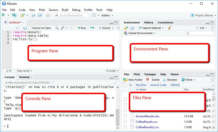
Illustration empruntée à ce livre